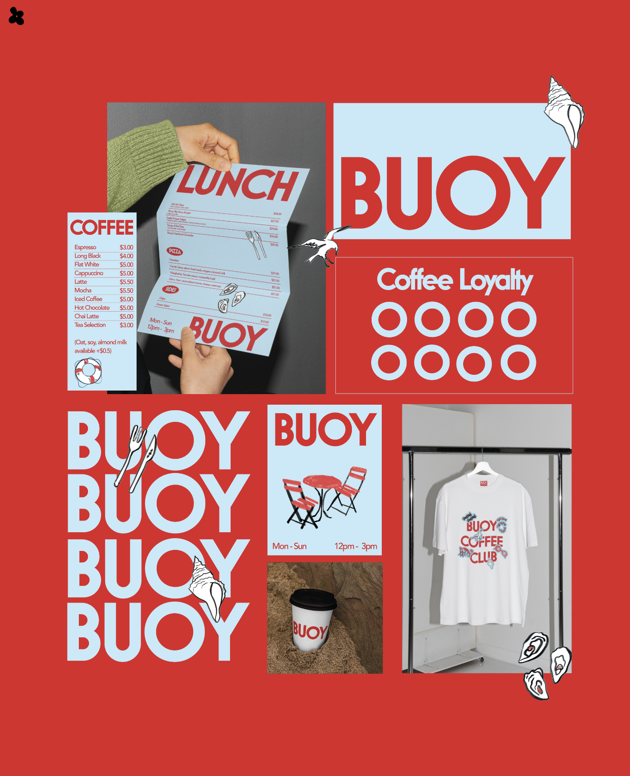
Buoy Café – Westhaven Auckland (Passion Project)
I created a bold, nautical inspired identity for this waterfront cafe, pairing a geometric sans-serif wordmark—where the “O” mirrors a life-ring with a fresh red-and-sky-blue palette. Playful hand-drawn icons of seagulls, oyster shells and folding café chairs bring Westhaven’s marina charm to menus, loyalty cards, cups and interior signage, tying every touchpoint back to the water’s edge.

Make it stand out.
Logo & Wordmark: Nautical Simplicity
A bold, geometric sans-serif wordmark anchors Buoy Café’s identity. The custom “O” echoes a life-ring, instantly evoking the Westhaven marina. A crisp red paired with sky-blue accents balances energy and coastal calm.
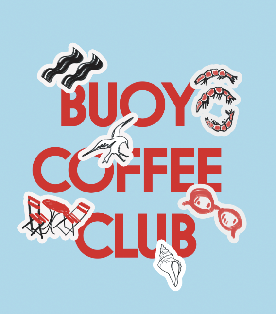
Illustrations & Icons: Harbor Motifs
Playful, hand-drawn sketches—seagulls in flight, oyster shells, folding café chairs and gentle waveforms—serve as spot graphics and stickers. These maritime elements bring the café’s water-front location to every menu, cup and wall.
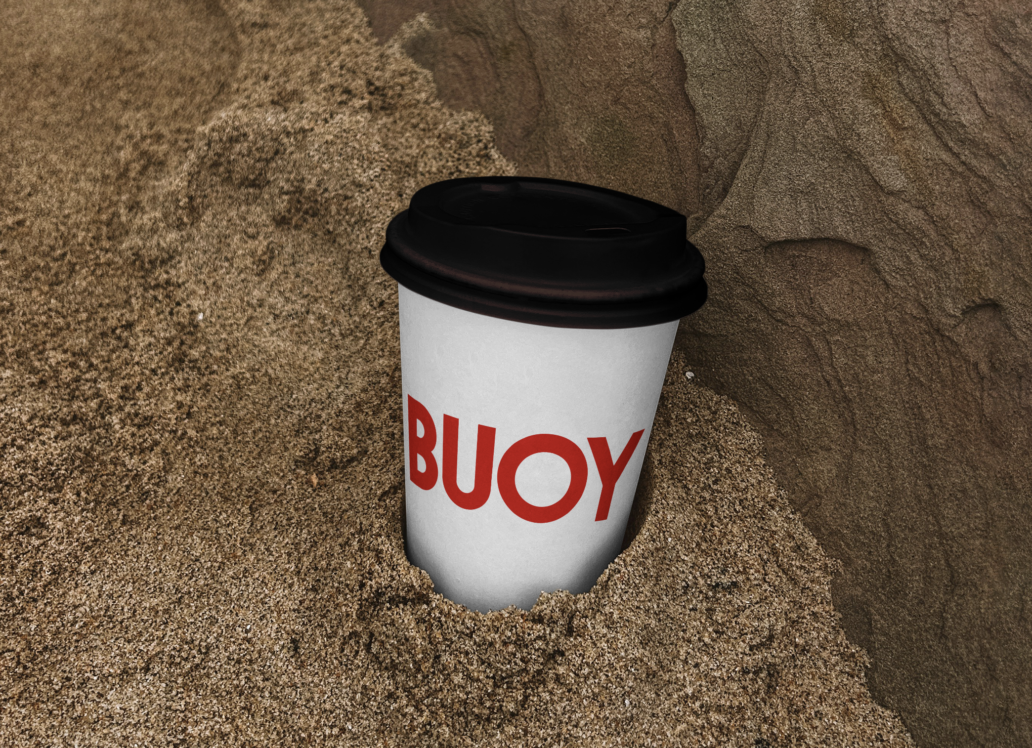
Applied Branding: Café Touchpoints
From the coffee-stamp loyalty card and takeaway cups to staff tees and interior signage, the vibrant red-and-blue palette and seaside icons create a cohesive, on-brand experience. Every touchpoint feels like a stroll along Westhaven’s lapping docks.