Roaming Rhythm – Mobile Bar Identity
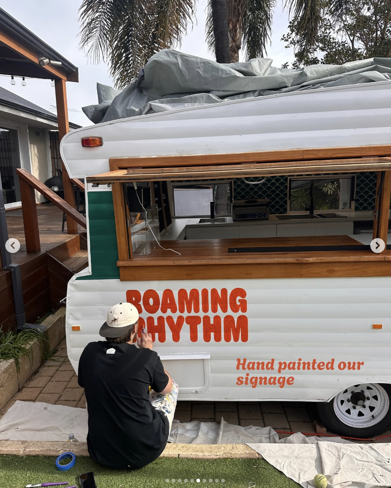
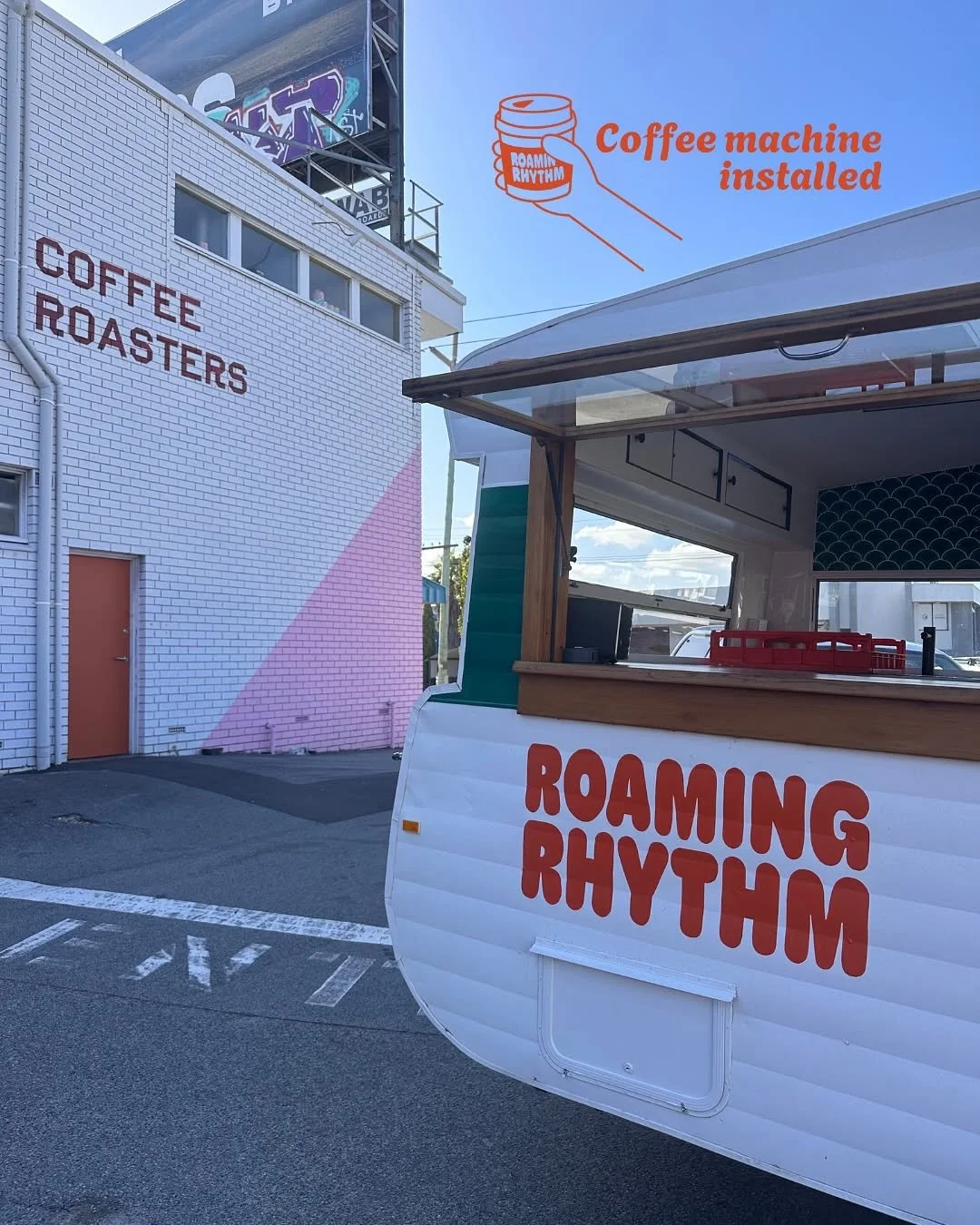
For this Perth-based mobile bar, I created a dynamic, versatile logo branding that moves with its audience. The custom “Roaming”-over-“Rhythm” wordmark (a rounded, friendly sans-serif) conveys motion and approachability, while a monoline mascot, part coffee cup, part cocktail glass, captures the day to night spirit. I rolled the identity out across van signage, takeaway cups, and packaging, ensuring every touchpoint feels cohesive and instantly recognizable on the road
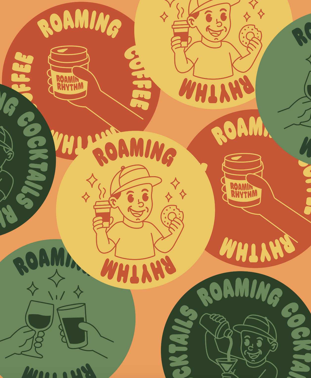


Logo & Wordmark: Emblem of Motion
The custom “Roaming”-over-“Rhythm” wordmark—set in a rounded, friendly sans serif—captures the mobile bar’s constant movement and inviting personality. Its slightly tilted baseline and open counters suggest the ebb and flow of service, from your morning espresso to evening cocktails.
Mascot Illustration: Day-to-Night Duality
A single-line mascot fuses a coffee cup and a cocktail glass into one continuous stroke, embodying Roaming Rhythm’s transition from dawn brews to dusk pours. This monoline figure is flexible enough to appear solo as an icon or paired with the wordmark for full-lockup applications.
Applied Branding: Road-Ready Cohesion
Every touchpoint—from van decals and menu boards to takeaway cups and staff uniforms—uses the same energetic wave motif and warm, punchy palette. This cohesion ensures Roaming Rhythm is instantly recognizable whether it’s parked at a street-corner pop-up or rolling through an all-day festival.