Power Foods - Waffles Packaging
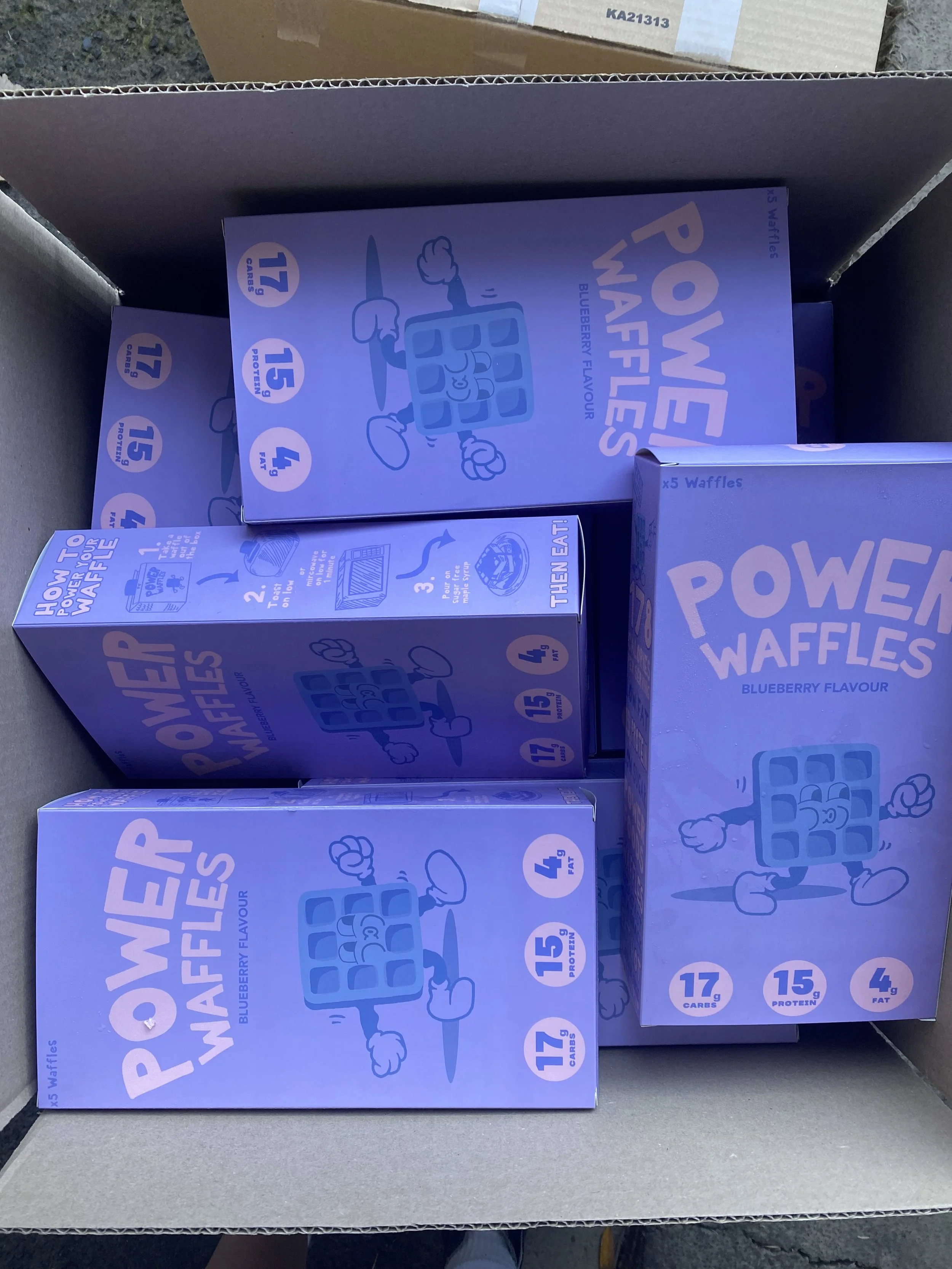
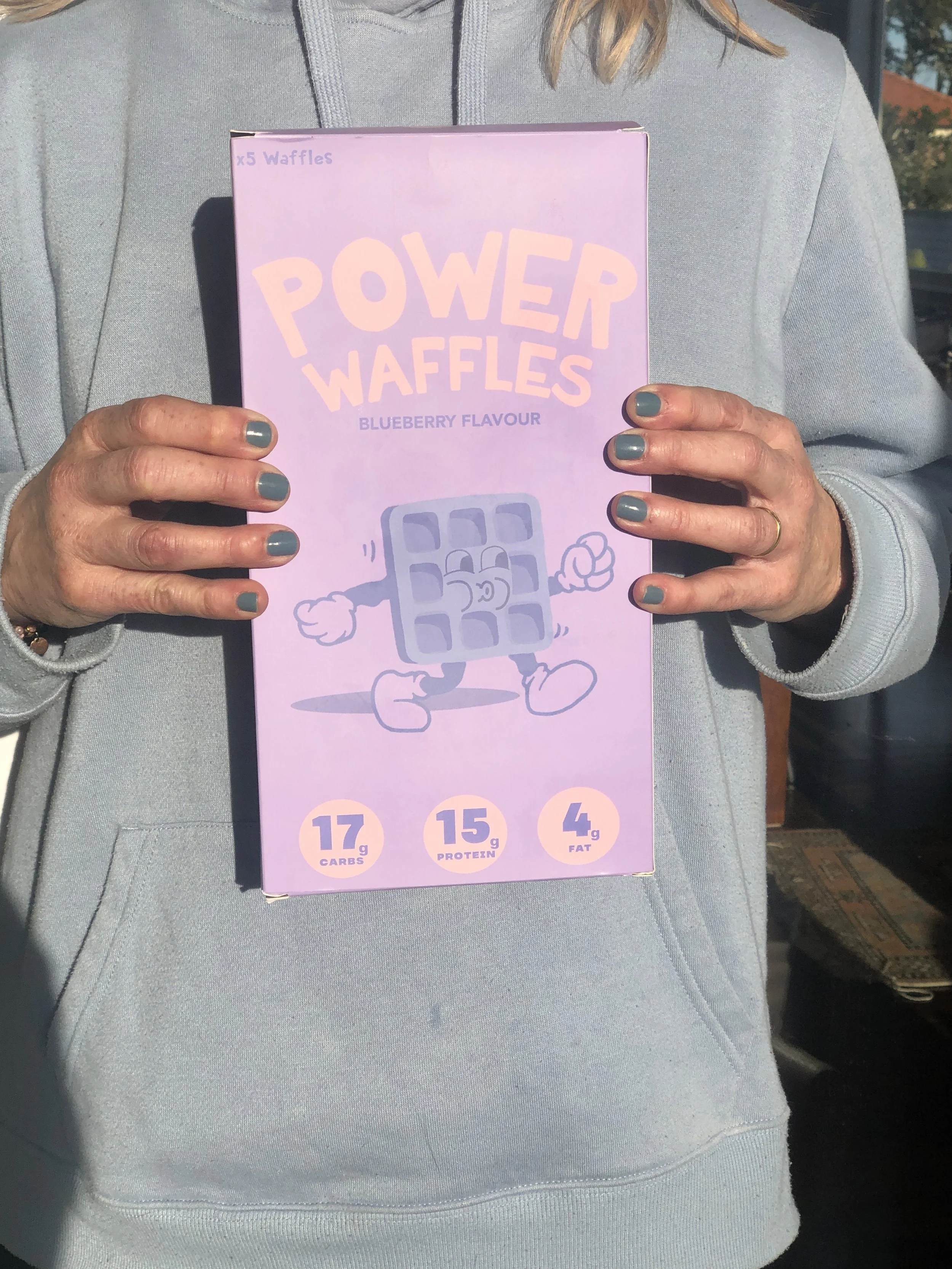
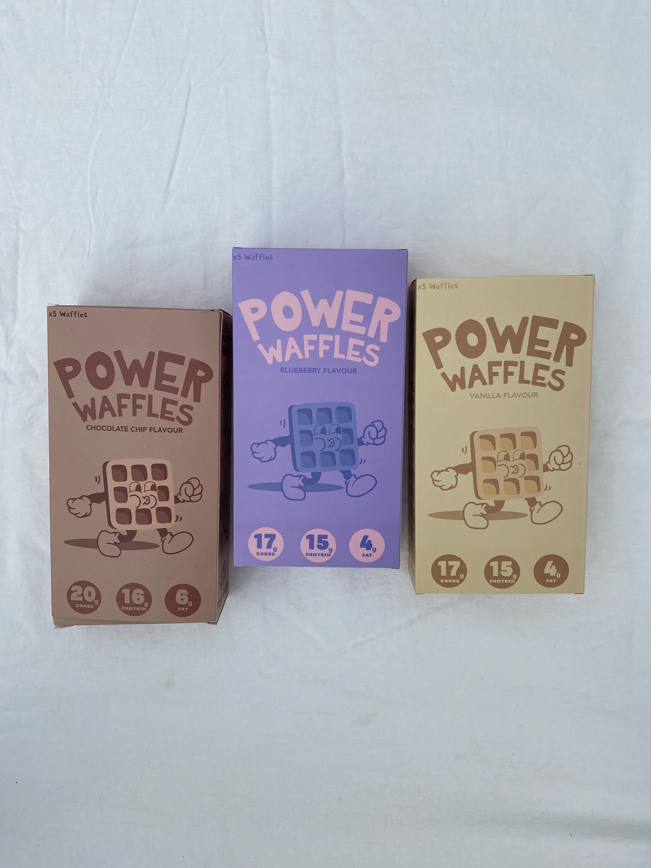
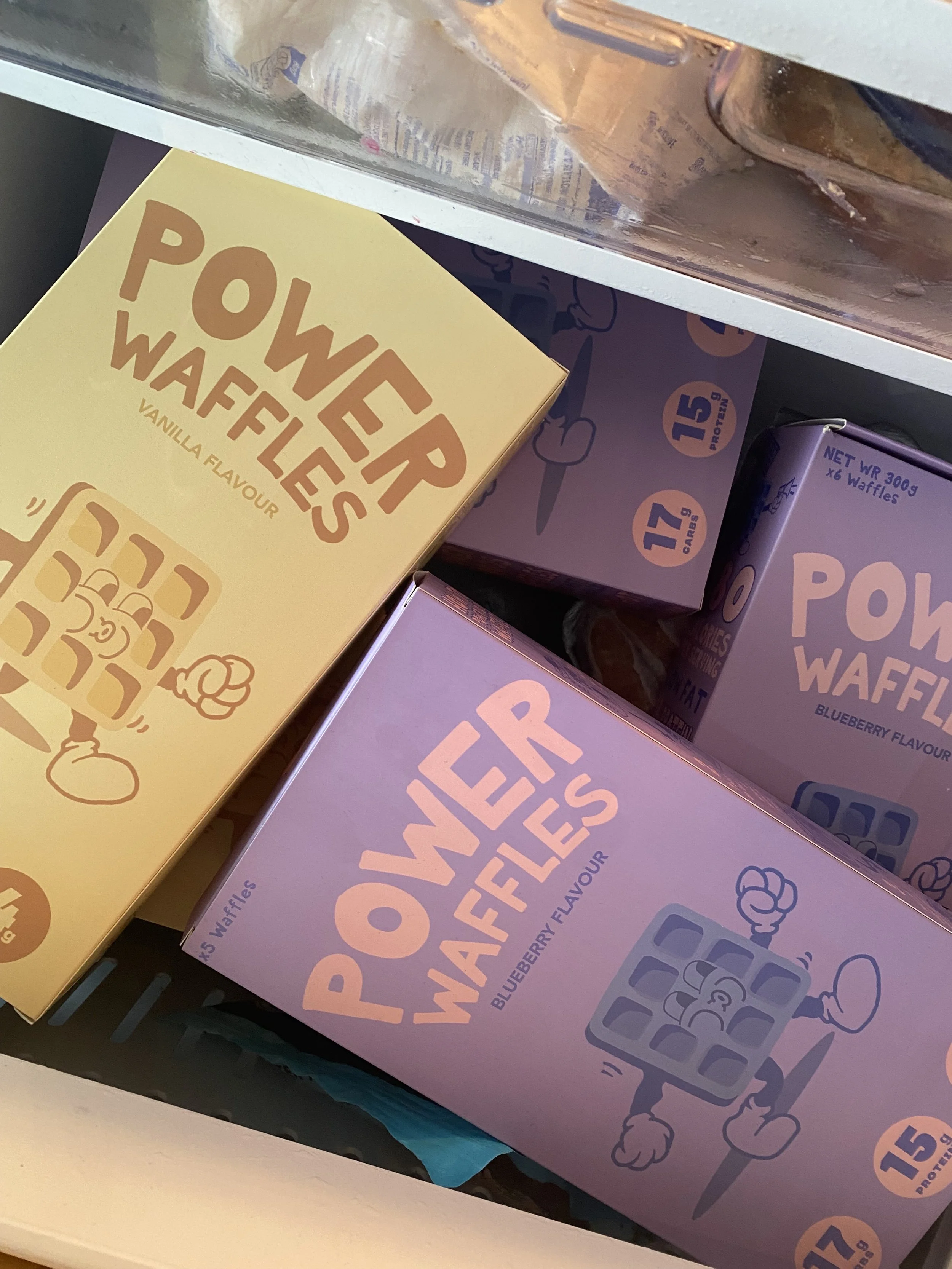
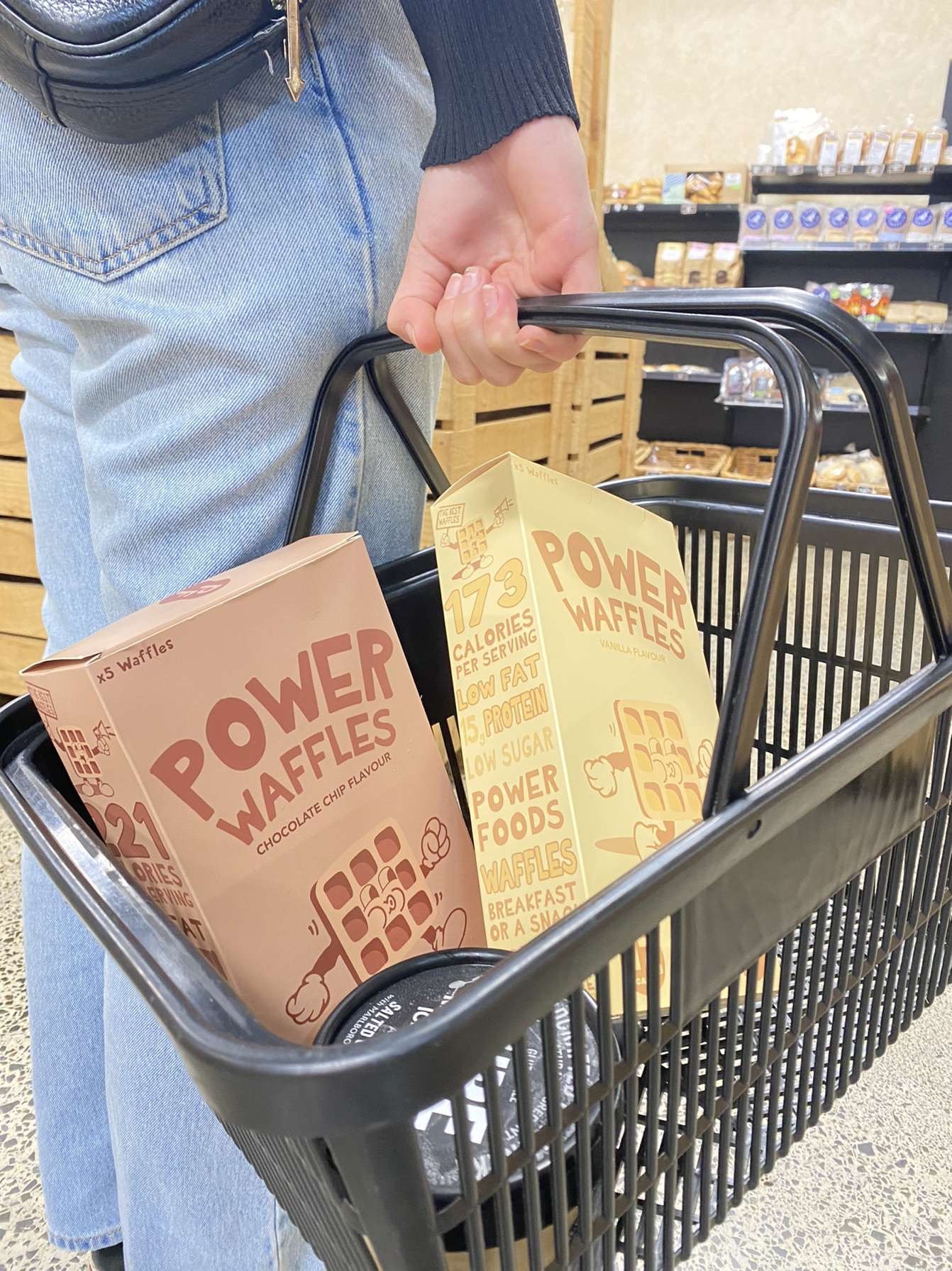
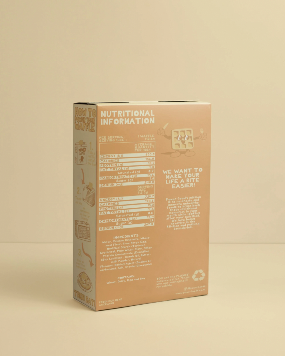
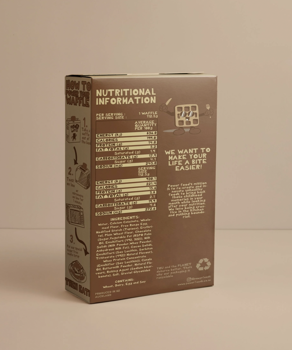
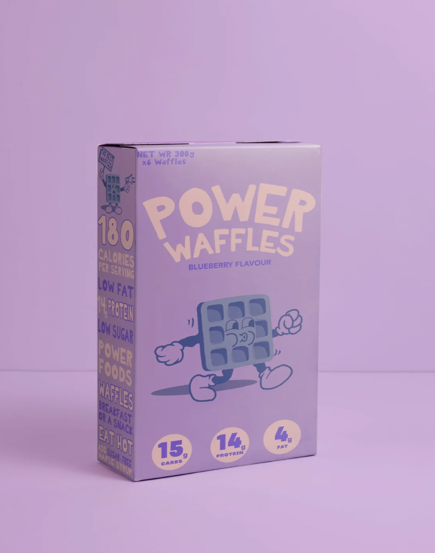
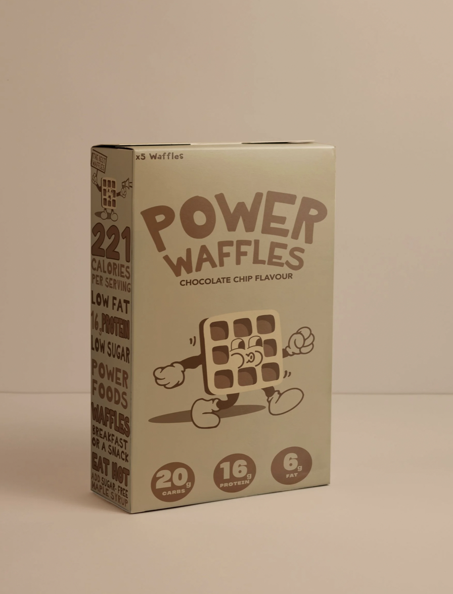
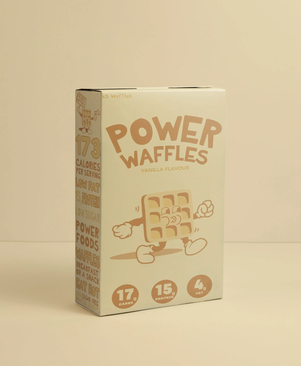
Packaging for Power Waffles, a high-protein waffle range from Power Foods. The goal was to make a healthy breakfast feel fun, not functional. A cheeky waffle mascot, chunky retro type and soft flavour-led colours make the range stand out on shelf and feel like a treat.
Packaging Design
Power Foods wanted packaging for its waffle range that would appeal to a younger, health-conscious audience without looking clinical. The nutrition benefits needed to be clear, but the brand had to feel playful, approachable and instantly recognisable across every flavour.
The design
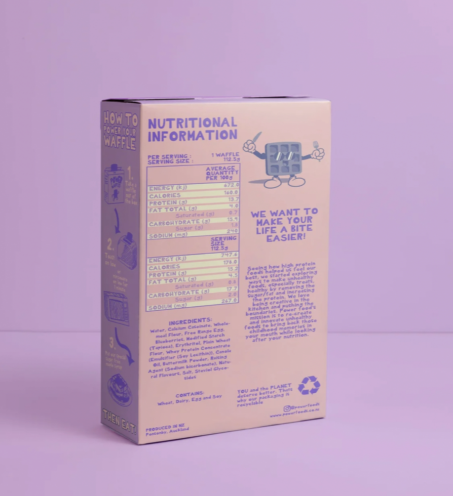
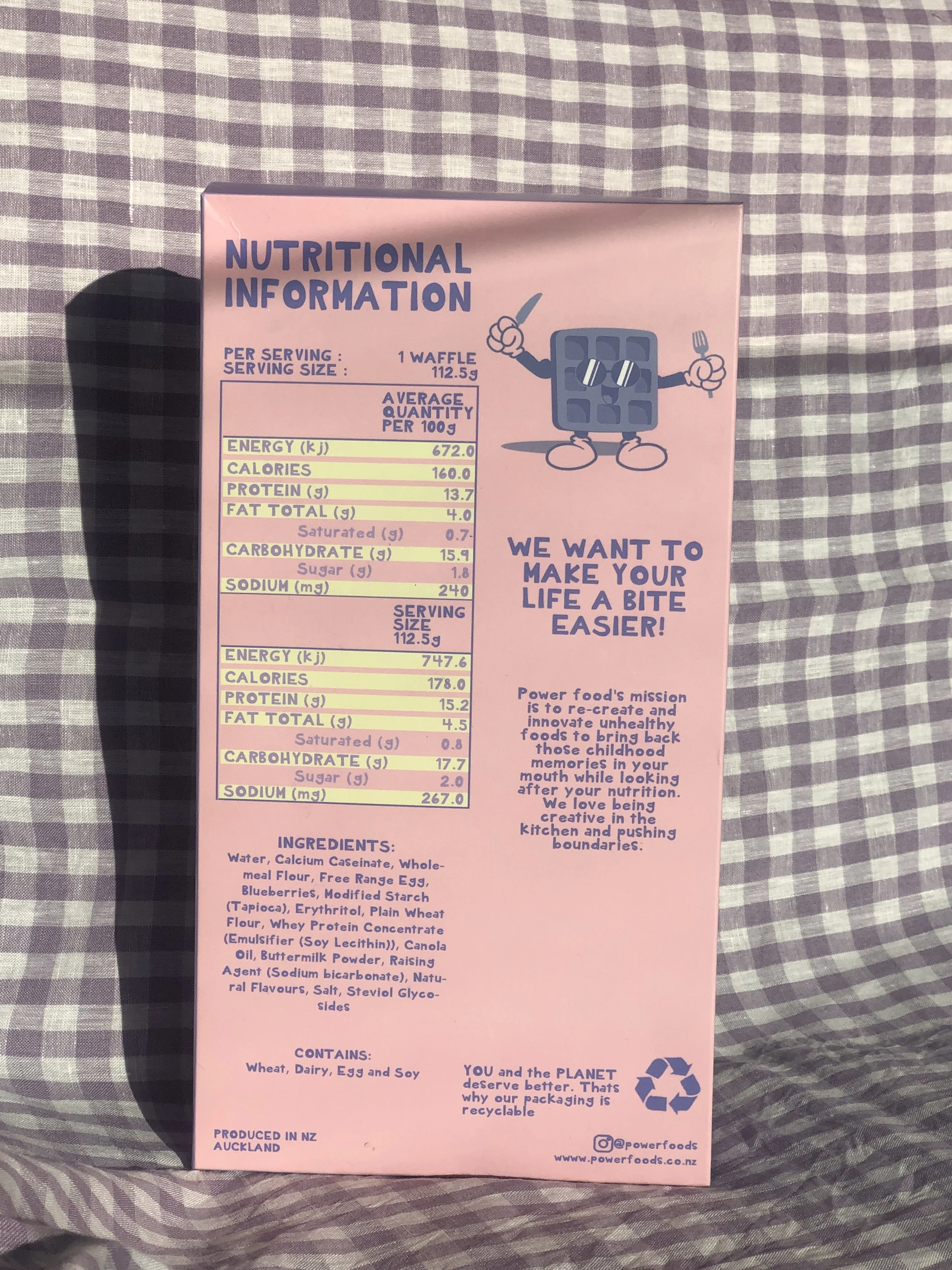
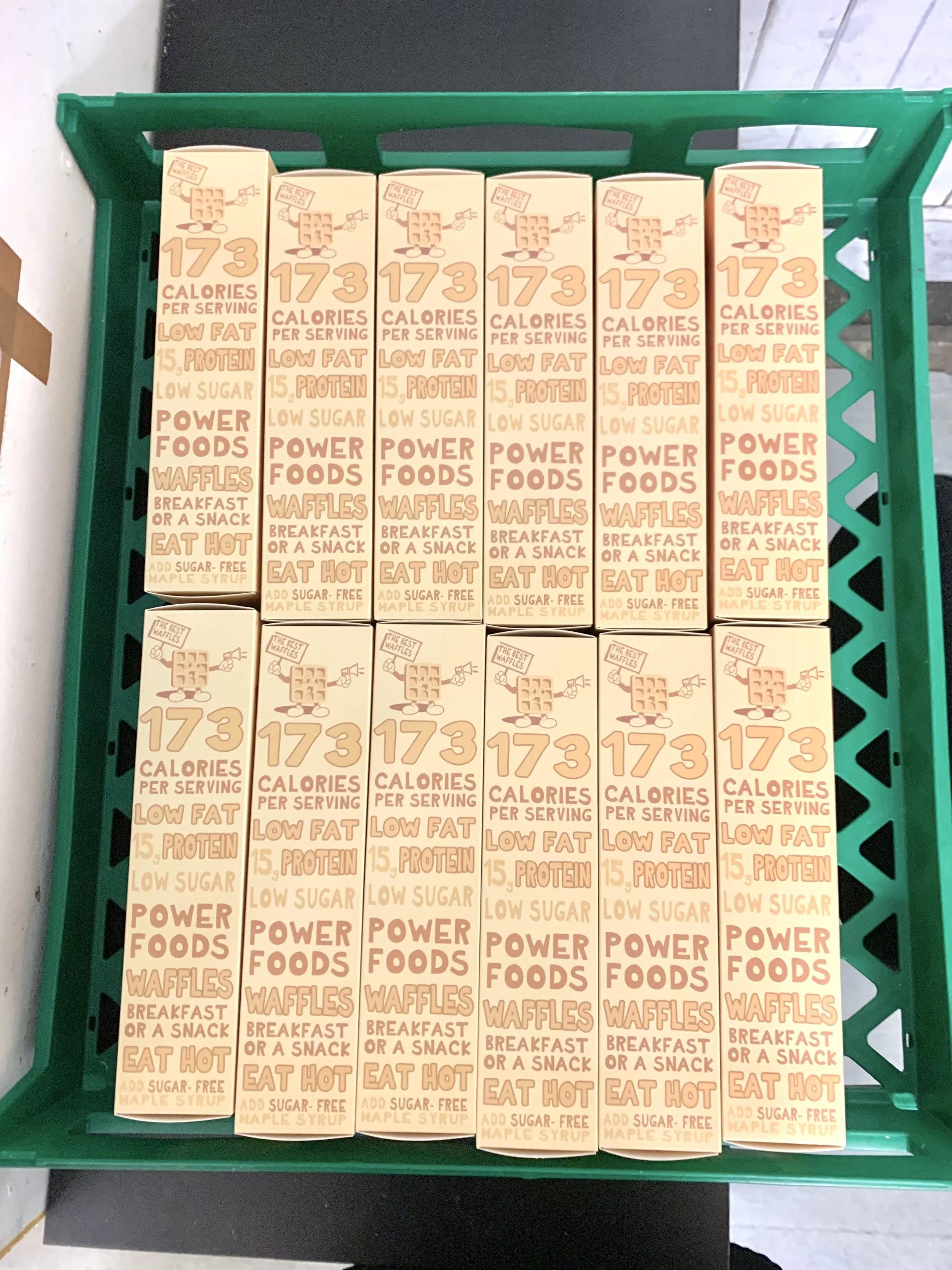
A mascot with personality: a hand-drawn waffle character who appears across the range, from the front of pack to the nutrition panel.
Flavour-led colour: each flavour owns its own colour, blueberry in lilac, chocolate chip in cocoa and [third flavour] in cream, so the range works as a family on shelf.
Nutrition made simple: key stats like calories and protein sit in bold, easy-to-scan badges, keeping the health message clear without taking over.
Details that make it human: side-panel cooking instructions and a friendly sign-off, "We want to make your life a bite easier!", give the brand a warm, conversational voice.
Deliverables
Packaging design for 3 flavours · mascot illustration · front and back of pack layouts · nutrition panel design